Cloudnine Hospitals
Print, editorial and environmental design for one of India's most respected fertility and maternal healthcare providers.
Visual Identity

Project Snapshot
Role: Senior Graphic Designer, agency side
Scope: An employee magazine; patient-facing print spanning IVF flyers, pregnancy information, and packages; and a single fertility-themed feature wall.
Client: Cloudnine Hospitals
Brief
Cloudnine Hospitals is one of India's most respected fertility and maternal healthcare providers. Their communication split in two directions at once: staff needed dense clinical and audit data made legible, patients needed IVF information and service details delivered with warmth, at one of the more emotionally loaded moments in their lives. Both had to read as unmistakably Cloudnine, built on a colour and type system the hospital had already established.
Approach
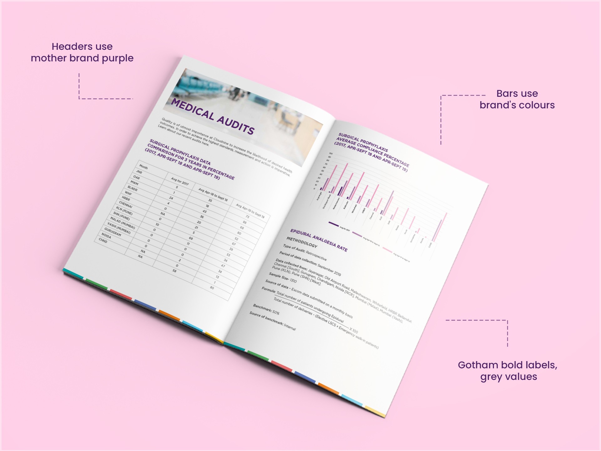
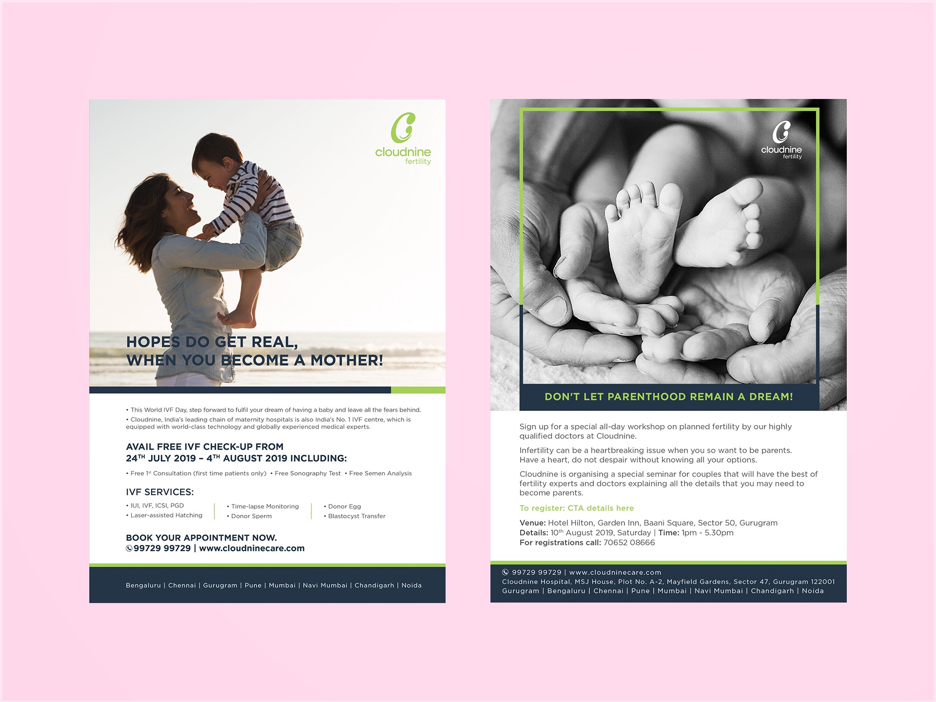
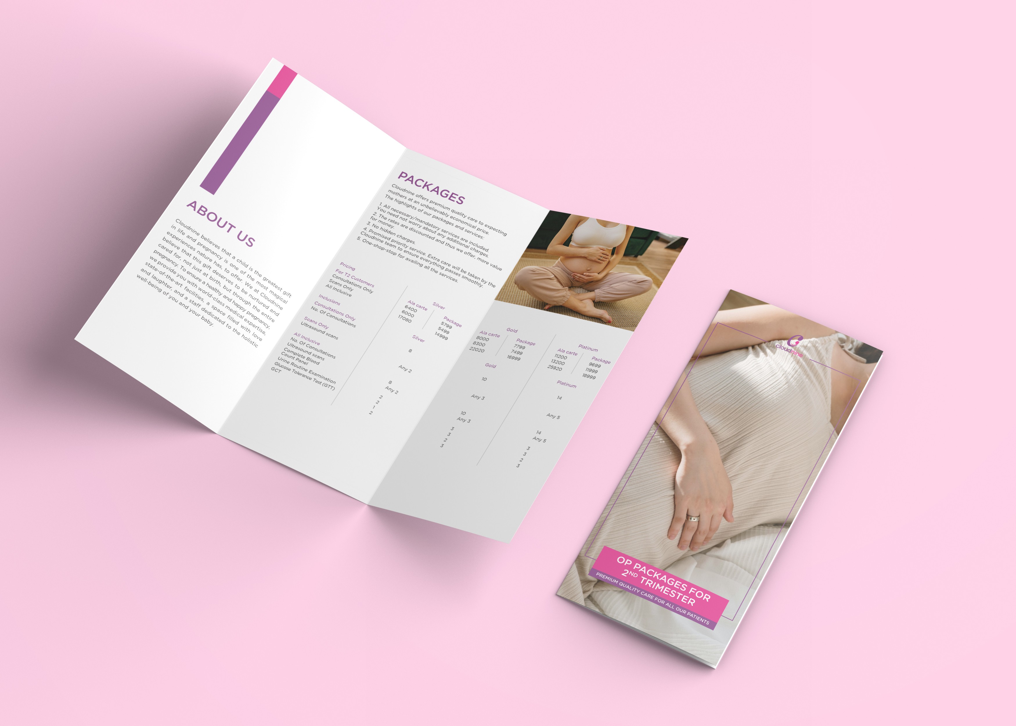
Three genuinely different jobs, one visual language: an internal magazine translating audit data for staff, patient-facing print covering IVF and pregnancy packages, and a fertility-themed wall greeting patients on arrival.
The colour system and Gotham typeface were already set before I started; applying that system with intent was the real work. Green on the fertility wall, matched to that specific vertical. The magazine's audit data runs in the mother brand's purple and magenta, since it speaks to the hospital as a whole.
Outcome
One visual language held its shape across a magazine, patient print, and a physical wall, through months of ongoing client review, three genuinely different production contexts that could easily have pulled a system apart. Each application became evidence of range: dense clinical data made legible for staff, warmth and clarity for patients navigating IVF, and a system extended into physical space, a first for this portfolio.
Reflection
This project taught me that holding a system together across genuinely different contexts is its own skill, separate from designing one from scratch. Cloudnine's colour and type rules were already set before I started; my contribution was choosing where within that system each piece belonged, green for the fertility wall, the mother brand's purple and magenta for the magazine's hospital-wide data.
Working solo across a magazine, patient print, and a physical wall meant thinking in three registers at once: legible data for staff, warmth for patients, a public space that had to read as Cloudnine before anyone stopped to read a word. It's also the first piece in this portfolio built for physical space, and it changed how I think about print systems generally, a system only really proves itself once it survives a context you didn't design it for originally.