Proper
End-to-end brand identity and campaign design for Proper, a self-directed food-transparency movement built around the UK's 2026 junk food ad ban. Covering visual identity, campaign strategy, social media and environmental design.
Visual Identity
Campaign

Project Snapshot
Role: Freelance brand designer based in London, solo creative direction and design, concept to execution.
Scope: Brand identity, campaign system, social content, environmental executions.
Tools: Illustrator, Photoshop, Firefly for photographic bases, composited by hand.
Photography: Licensed stock (Pexels, Unsplash)
Status: Self-initiated concept project, designed in response to a real piece of legislation, the UK's 2026 junk food ad ban. I built the identity, campaign structure, and reward mechanic as one connected system, working through positioning, brand system, and execution in full.
Brief
Since January 2026, junk food brands in the UK can't run ads before 9pm. Proper is built to exist inside that exact gap, a concept the ban itself makes possible.
Proper is built around one tension: investigate without shouting. Closer to a mate reading a label out loud at the fridge than an activist with a placard. Wholesome on the surface, sharp underneath.
Brand System
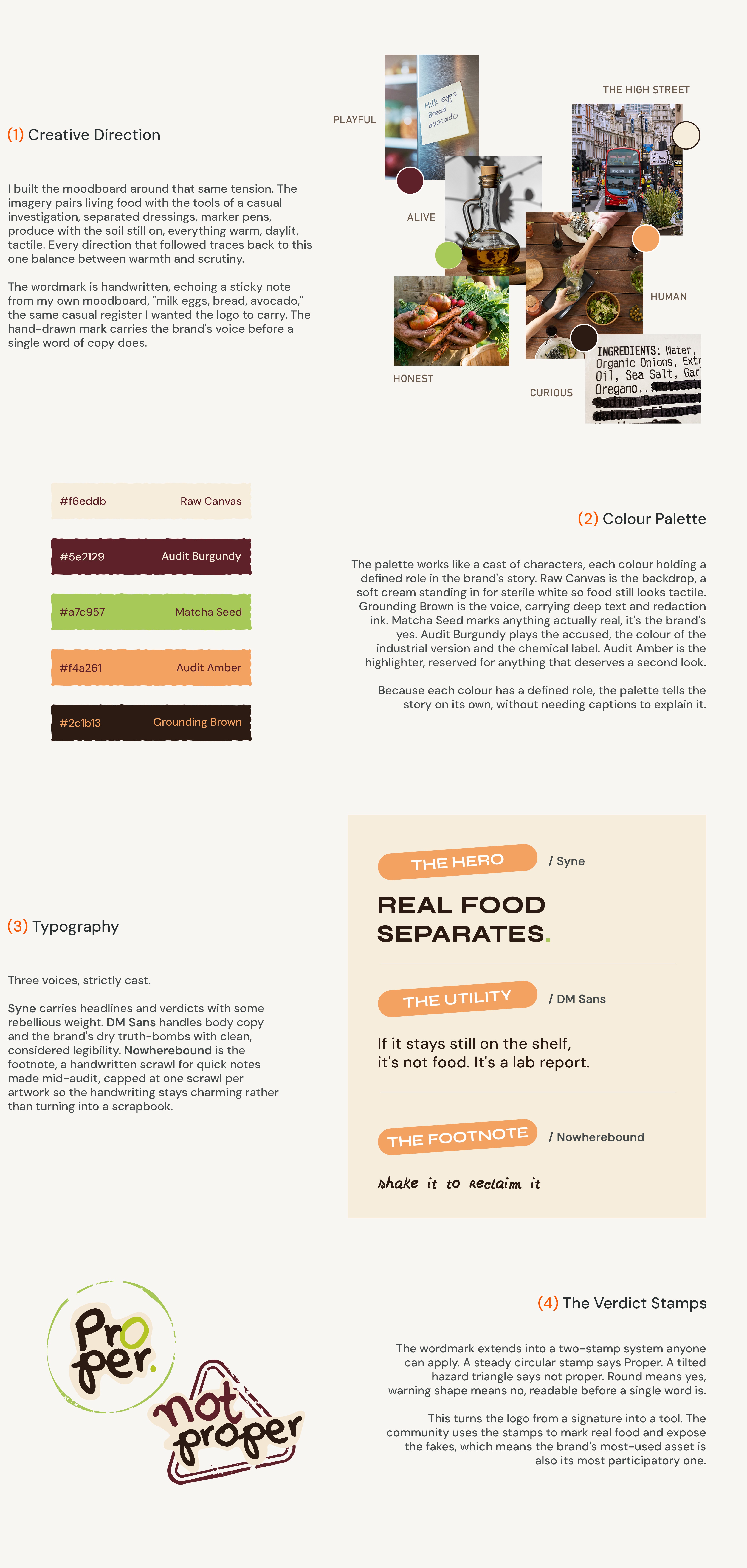
The Proper visual identity system pairs a deliberately hand-drawn, whistleblower voice with a role-based colour and verdict-stamp system, carrying one consistent tone from a phone photo to a printed poster.
The Loop: Expose, Eat, Earn
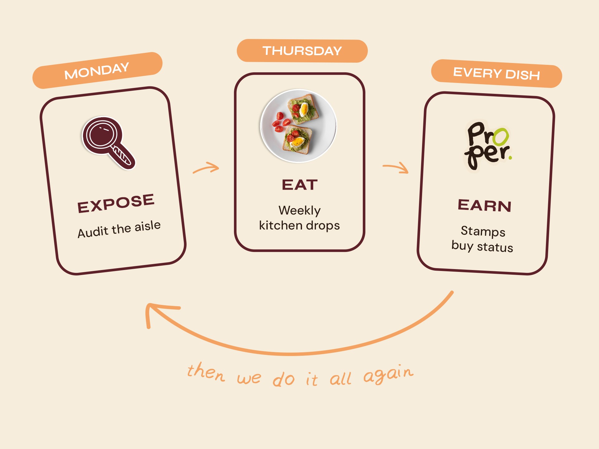
Everything Proper runs collapses into three words, one continuous cycle where each part feeds the next.
Expose. Find a label you don't trust, photograph it, post it with #ProperExpose.
Eat. Every Thursday, inside a small independent kitchen, the week's most-suggested product gets its ingredients read out loud in plain English, then remade properly, live.
Earn. Stamps build toward a seat at a table where both versions sit side by side, and you decide for yourself.
Then the loop sends you back to your own fridge.
Social Media Grid
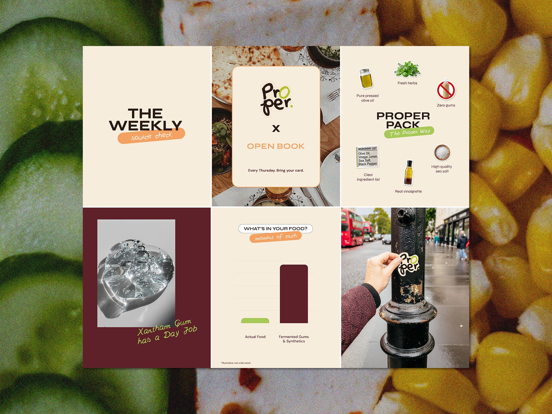
Proper's Instagram grid does two jobs. It introduces the brand to people discovering it for the first time, and keeps the campaign visible for people already following it. Each post format is designed around one of these two goals.
Comparison posts, like the ingredient-versus-additive graphic, present honest, transparent information. Every claim is marked illustrative, staying true to Proper's straight-talking brand voice.
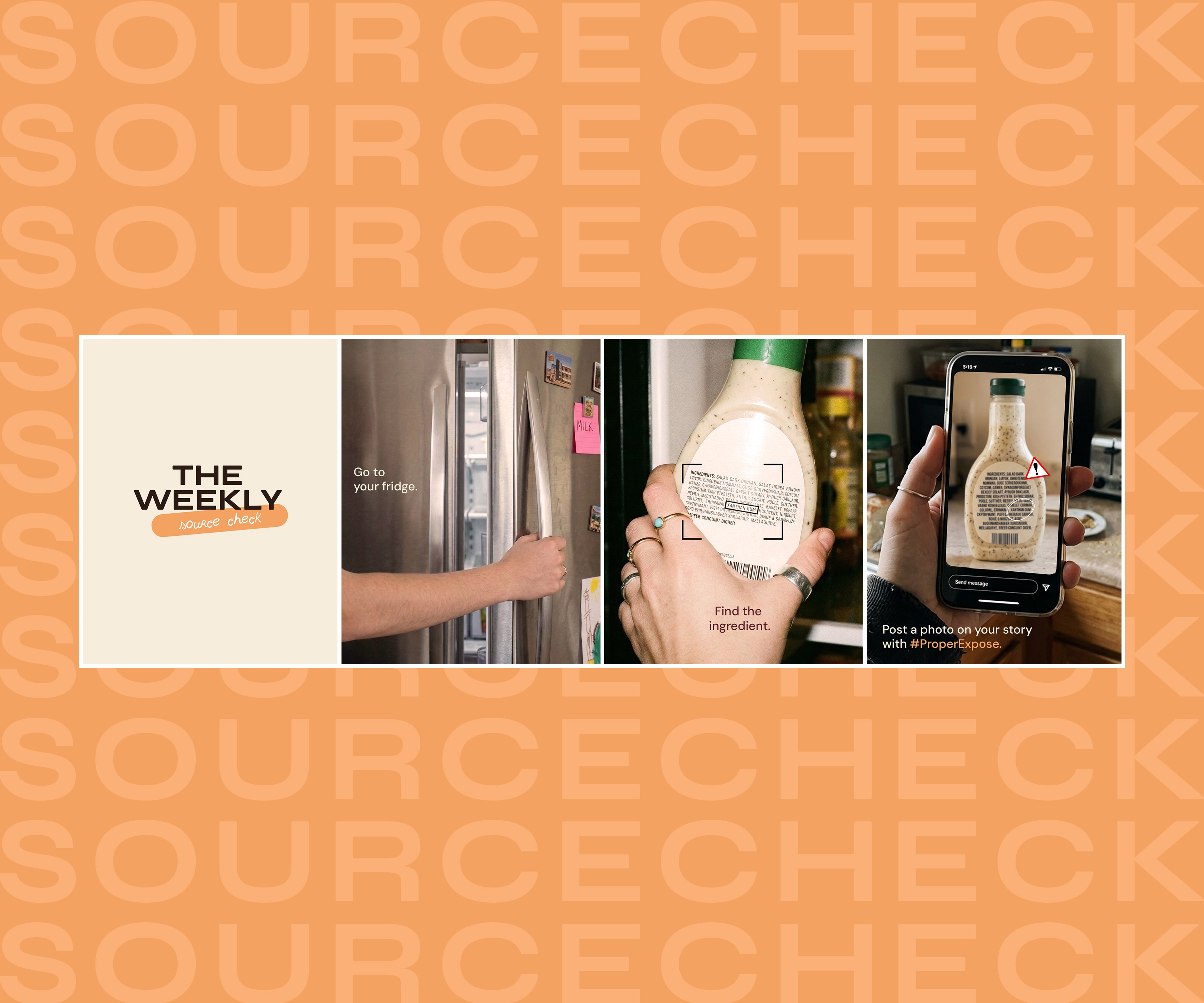
The Weekly Source Check
This carousel is the core mechanic in miniature, and it's the on-ramp into everything else. It turns the reader into the demonstration, doing exactly what the brand does is what turns someone scrolling past into someone posting under #ProperExpose within the same few seconds.
Out in the World
Three out-of-home placements take the campaign into London itself, each chosen for what people are doing at the moment they see it.
The London Underground poster relies on platform dwell time. Commuters often wait thirty seconds or more with nothing else to do, which is enough time for a redacted ingredient list to actually get read and questioned rather than just glanced at.
The bus advertising banner works on the opposite principle: a quick look from a pavement, a car, or a stopped double-decker at a bus stop, often near someone already holding a snack. That fast-glance moment needs one clear line, not a paragraph, so the message states a single fact and lets it land. This ad space usually belongs to snack and drink brands, so placing Proper here takes over ground they'd expect to own.
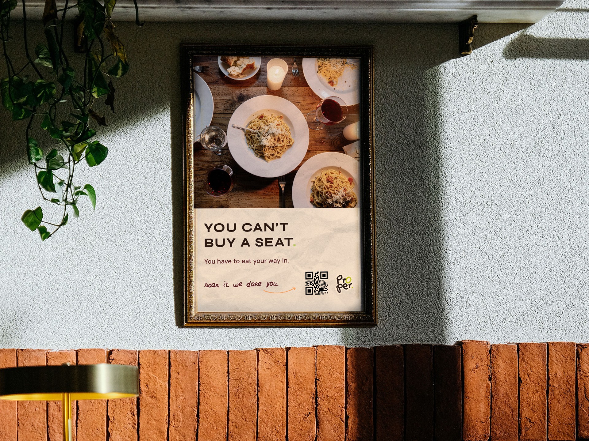
The restaurant poster turns that same thinking back on Proper itself. "You can't buy a seat," it states, then answers its own line: "you have to eat your way in." The QR code leads straight to the mechanic itself, since Off-Menu access has to be earned. It's the pivot from provocation to invitation, which is why it sits just ahead of the section explaining exactly how that access works.

The Off-Menu Table
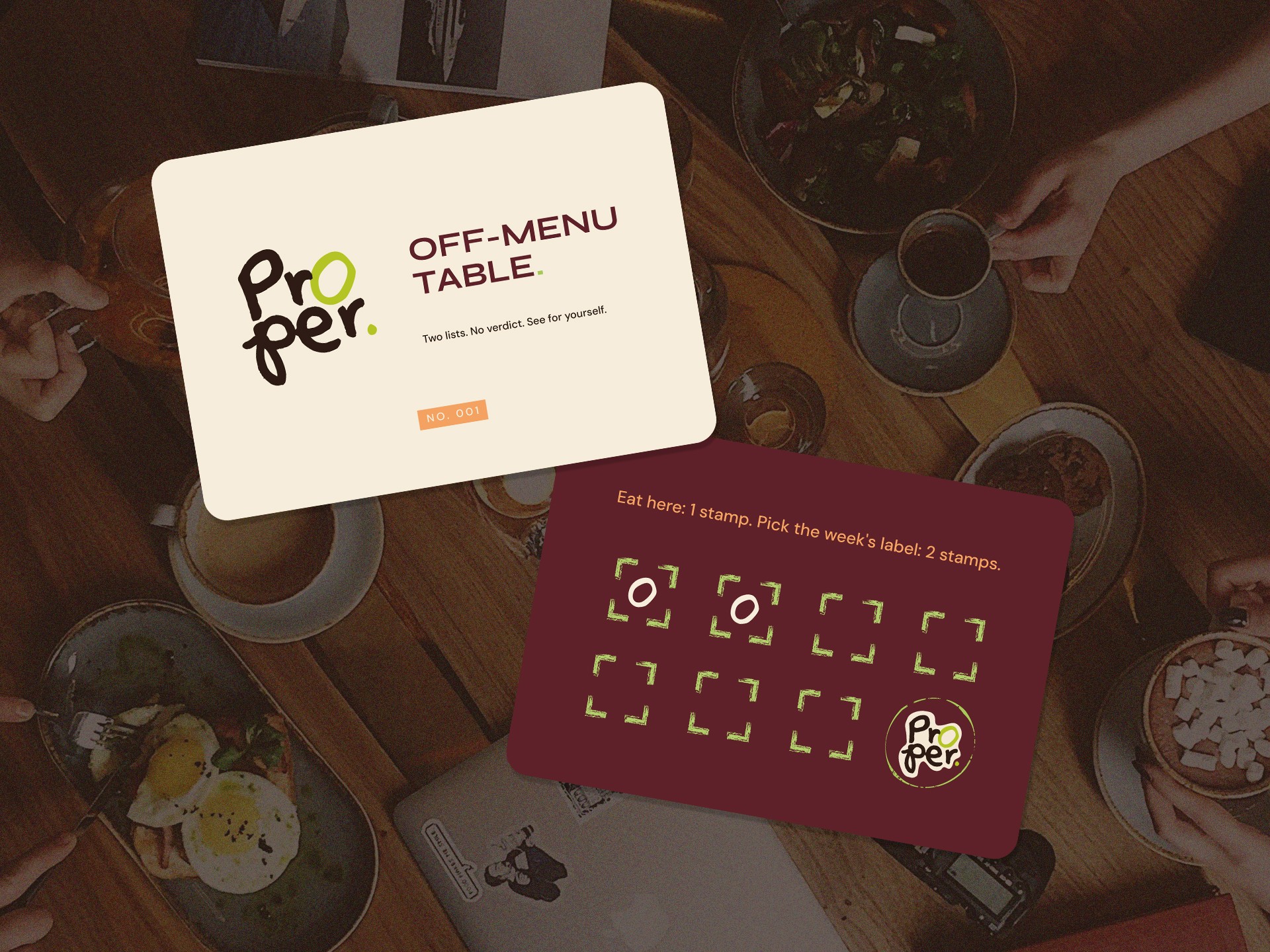
The Off-Menu Table turns Proper's whole idea into something you can taste: a loyalty reward built entirely around proof.
Every Thursday at Open Book, a small independent kitchen in London, showing up earns a stamp, and nominating the week's product, if it gets picked, earns two.
At eight stamps, you get a seat at the Off-Menu Table. The chef sits with you and walks you through both plates, why this ingredient over that one, what a factory does differently to a kitchen, what changes when a preservative gets swapped for real salt. You taste the shop-bought version next to the chef's own and reach your own verdict from the flavour itself. It's a chef who once wrote labels like the one in front of you, now explaining, in person, exactly what changed.
That's the actual payoff. You don't just leave with a full plate, you leave knowing how to read a label properly yourself, the next supermarket trip, you're checking ingredients the way the chef just showed you, not guessing. It's the moment the whole habit sticks, and it sends you straight back to your own fridge, which is exactly where this all started.
Reflection
Proper started as a response to a real piece of legislation and became an exercise in campaign systems thinking. The visual language came together quickly once the "friendly whistleblower" tone was set.
The real challenge was making the reward mechanism hold up to scrutiny: what does someone actually get, why can't they get it anywhere else, and does the answer survive a follow-up question. Working that logic through, translate the label rather than accuse the brand, tie the reward to access rather than food, was the design problem this project actually posed.
Let's Talk
If you want a designer who thinks in systems, brand, campaign, and mechanic working as one, get in touch.